In a nutshell
- 🔍 Use mirrors to multiply light and views; place large panels opposite windows, align seams deliberately, choose low-contrast frames, and curate reflections; specify toughened glass in high-traffic UK zones.
- 🎨 Embrace colour drenching to erase edges: match walls, skirting, and trims; choose high LRV hues, keep fabrics low-contrast, and lift ceilings 10–15% lighter for perceived height.
- 📏 Prioritise negative space with fewer, larger pieces on legs, an oversized rug to unify zones, rounded tables for flow, and pocket/bifold doors to reclaim floor area.
- 💡 Build layered lighting focused on vertical illumination: wall washers, uplighters, under-cabinet strips, and backlit mirrors; balance matte textures with selective sheen and add dimmers for flexible depth.
- 🧭 Treat expansion as a system: combine reflection, low-contrast palettes, proportion, and lighting to extend sightlines; start with the move that offers the biggest optical return for your layout.
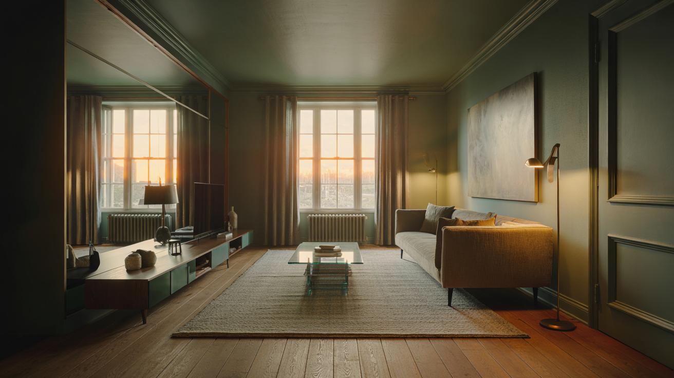
Designers whisper it on site visits and murmur it on mood boards: the most reliable way to make a small room feel big is to control what the eye believes it sees. In practice, that means crafting optical continuity—borrowing light, extending lines, and erasing visual stops so the mind reads more volume than the square footage supplies. It’s not sorcery. It’s strategy. The linchpin is reflection, but not just the obvious mirror trick. Think coordinated colour drenching, continuous flooring, and lighting that brightens walls rather than puddling on the floor. The room expands in perception the moment its boundaries dissolve, its edges soften, and its brightest surfaces carry your gaze farther than the walls actually run.
The Mirror Multiplier: Borrowing Light and Space
The oldest illusion still does the heavy lifting. Mirrors don’t merely reflect; they multiply light, views and architectural rhythm. Place one opposite a window and you’ve doubled the apparent glazing. Angle it towards an arch or bookcase to repeat structure and suggest depth. Put the largest mirror you dare opposite your brightest view. Scale matters: tall, near floor-to-ceiling panels stretch proportions; a wide horizontal slab broadens a narrow room. In tight halls, a mirrored door or a flush panel at the end wall reads like an opening instead of a stop.
Frame choice sets the tone. Slim, low-contrast frames merge with the wall, while antiqued or bronze tints soften glare and feel chic in period homes. For built-ins, mirrored backs behind shelves add shimmer without the blare of a big single pane. Mind your seams: a simple vertical joint aligns with door casings to feel intentional. Safety counts in UK homes—specify toughened glass in high-traffic spots—and keep reflections of clutter out of sightlines. Mirrors expand only what they show, so curate what lands in the frame.
Colour Drenching and Low-Contrast Palettes
Colour can push walls apart without moving them. The tactic is colour drenching: paint walls, skirting, architraves and even radiators in one hue to dissolve edges. When the eye doesn’t snag on contrast, the room reads calmer and, paradoxically, bigger. Opt for mid-to-light tones with a decent Light Reflectance Value (LRV) to boost brightness. Match skirting boards to walls and the perimeter line vanishes, giving you precious perceived inches. If you prefer subtle dimension, shift the ceiling 10–15% lighter in the same family to lift height without creating a stark band.
Finish matters. A soft matt on walls keeps surfaces receding; a gentle satin on woodwork introduces a tiny bounce that adds vitality. In north-facing rooms, warm greige or stony taupe offsets the cool cast, while south-facing spaces love cooler blue-greys that stay crisp. Keep fabrics and large furnishings within a low-contrast range—variations of texture, not big colour jumps—so the envelope remains uninterrupted. For open-plan flats, continue the colour through connecting spaces and corridors to elongate the experience. One continuous shade across multiple surfaces reads as architecture, not mere decoration.
Line, Scale, and Negative Space
Even the best palette shrinks under the wrong proportions. Designers obsess over negative space—the empty volume around objects—because it’s what your brain uses to judge scale. Choose fewer, larger pieces with clean legs and air beneath to keep the floor flowing. A generous rug that tucks under sofas and chairs unifies seating and makes the perimeter feel farther away. Let sightlines run—past a low-back sofa, under a floating console, through glass or open shelving—so the room doesn’t fragment into visual roadblocks.
| Technique | What It Does | Best For | Cost | Difficulty |
|---|---|---|---|---|
| Large Mirror | Duplicates light and views | Dark corners, narrow halls | ££ | Low–Medium |
| Colour Drench | Erases visual edges | Low ceilings, busy trims | £ | Low |
| Oversized Rug | Unifies zones, widens feel | Living rooms, studios | ££ | Low |
| Floating Storage | Reveals flooring, lightness | Small bedrooms, halls | ££ | Medium |
Scale up lighting and art as well. A single large canvas clears visual chatter better than a fussy gallery. Dining tables with rounded corners ease flow. Replace swung doors with pocket or bifold where possible; that reclaimed floor area is palpable. And edit ruthlessly: the empty 30% is not a missed opportunity, it’s the amplifier for the other 70%. In small spaces, what you remove is as powerful as what you add.
Layered Lighting and Surface Sheen
Light determines depth. The mistake? Overhead glare that flattens everything. Aim for vertical illumination—light on walls—because we read brightness at eye level as spaciousness. Use wall washers, picture lights, and slim uplighters to push light into corners. Light the walls, not just the room. In kitchens and studies, under-cabinet strips remove shadows that make planes feel cramped. Backlight shelves or mirrors to float them off the wall, creating a halo of depth without visual clutter.
Surface sheen helps you steer bounce. Satin or silk-emulsion on ceilings reflects softly, lifting height; a touch of gloss on a door or the inside of a reveal pulls daylight deeper into the plan. Balance with matte textiles—bouclé, linen, wool—to avoid a showroom glare. Sheer curtains diffuse privacy while keeping the window wall bright, a critical “light source” in gloomy British winters. And don’t neglect dimming: brighter by day, lower by night, always with multiple circuits. When light is layered, the envelope expands and the furniture becomes sculpture within it.
The best-kept secret isn’t a single purchase; it’s a system. Mirrors to borrow light, colour to erase edges, proportions that celebrate negative space, and lighting that lifts the vertical plane—together they transform the way a room is perceived. None of this fights the architecture; it collaborates with it. Start with one move that offers the biggest optical return for your layout, then layer patiently. Small homes can feel generous when every choice lengthens a sightline. Which technique will you test first to make your space breathe—reflection, colour, editing, or light?
Did you like it?4.5/5 (20)