In a nutshell
- 🌞 Yellow acts as a “daylight proxy,” boosting energy and optimism through warm wavelengths and positive associations, making it the go-to mood booster for UK homes.
- 🏠 Best used in kitchens, hallways, and north-facing rooms, small doses (lampshades, cabinetry, textiles) often outperform full-room coverage; balance with grounded neutrals to avoid saccharine schemes.
- 🎨 Get the tone right by testing A4 swatches in changing light; aim for mid–high LRV values and softened hues (primrose, ochre) that glow by dusk rather than read as highlighter-bright under cool LEDs.
- 💡 Pair warm 2700K lighting with washable eggshell or matte finishes; natural materials (timber, rattan, aged brass) amplify warmth, while chrome and stark white can turn yellow acidic.
- 🧰 Think practical and sustainable: choose low-VOC paints, use rental-friendly moves (painted furniture, skirtings), and build impact through layering—walls, cushions, prints—for a cohesive, uplifting glow.
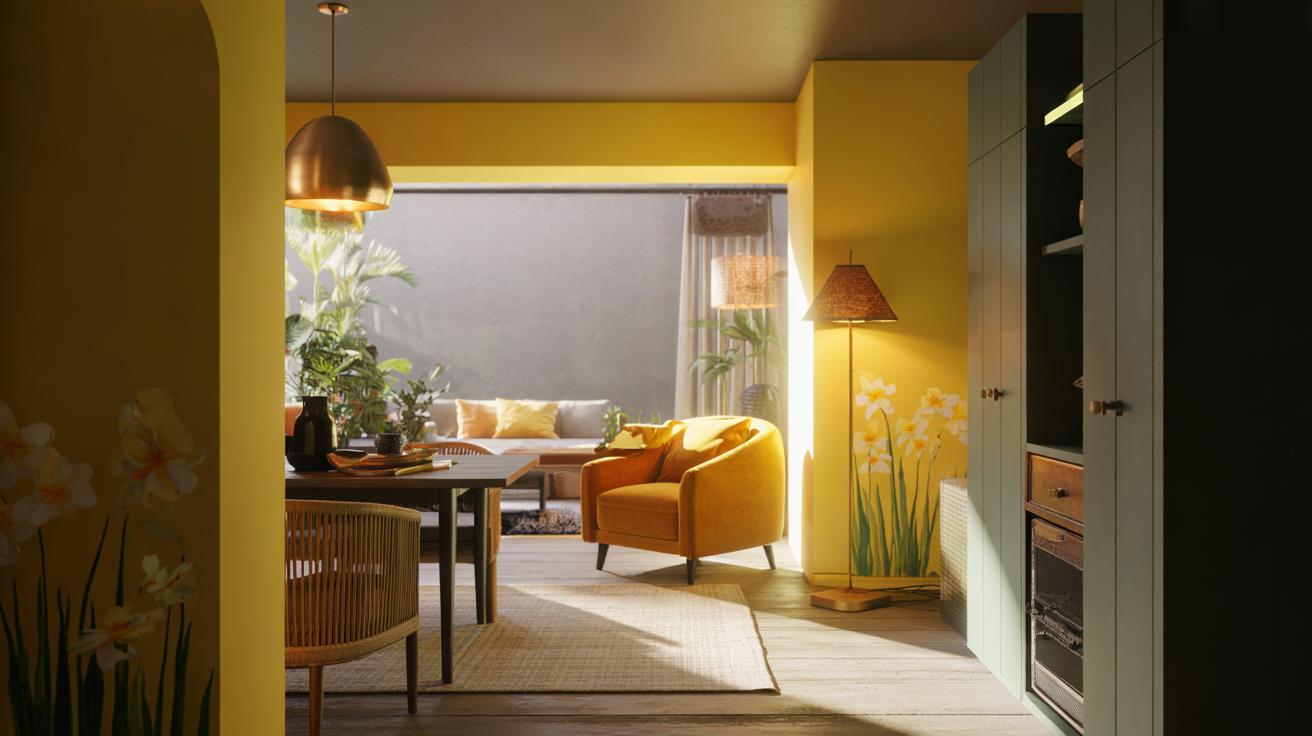
Every few seasons a shade steals the spotlight, but one hue keeps returning whenever spirits need lifting: yellow. Designers across the UK describe it as a tonic for grey skies and long commutes, a colour that catches the light and sends it dancing around a room. It brightens breakfast nooks, peps up hallways, and gives rented flats a welcome sense of cheer. Used thoughtfully, yellow can transform how a home feels from the moment you open the door. The trick isn’t simply picking any lemony pot and rolling it on. It’s understanding why this colour energises us, and where it works hardest in British homes.
The Psychology Behind Yellow’s Uplifting Power
Ask a colour psychologist why yellow boosts mood and you’ll hear a blend of science and symbolism. Humans have evolved to associate warm wavelengths with daylight and ripeness, a perceptual shorthand that signals alertness and reward. Research regularly links saturated warm tones to higher perceived energy and mild increases in arousal, the kind that helps us start tasks or socialise more readily. That’s why designers often call yellow a daylight proxy, especially valuable through British winters and in north-facing rooms. It’s not magic; it’s our visual system primed to expect warmth when the spectrum tips toward gold.
There’s also memory at play. From school buses to harvest fields, yellow cues optimism, safety, and abundance. In interiors, that translates as a gentle nudge toward conversation in a kitchen, or a sense of welcome in a corridor that otherwise feels forgotten. The caveat? Intensity matters. Lean too citrus and the effect can feel anxious under cool LEDs; slip to ochre and the mood relaxes. The sweet spot, experts say, is a softened, slightly muted yellow that reads sunny by day and glows at dusk.
Where and How to Use It at Home
The UK’s capricious light can flatten colours. Yellow fights back, bouncing available brightness into corners and over worktops. Kitchens, breakfast rooms, and entryways are prime candidates. So are gloomy landings and north-facing box rooms that need a morale boost. If you rent, try a painted console, a scalloped lampshade, or a canary-lined bookcase for drama without commitment. Small shots of yellow often deliver more lift than an all-over blast. Pair with grounded neutrals—mushroom, greige, or soft charcoal—to stop the scheme from feeling saccharine and to give the eye places to rest.
Finish and light temperature are crucial. In hardworking spaces, an eggshell or washable matte keeps smudges at bay. Under cool 4000K bulbs, choose warmer, honeyed tones; under warm 2700K lamps, a fresher primrose reads crisp rather than custard-like. Timber, rattan, and aged brass amplify yellow’s warmth; chrome and stark white can make it feel acidic. Use this quick guide to dial in placement and tone:
| Shade | Effect | Best Room |
|---|---|---|
| Buttery Yellow | Soft, nostalgic glow | Kitchen, nursery |
| Marigold/Ochre | Grounded, autumnal warmth | Living room, hallway |
| Primrose | Crisp, clean brightness | Bathroom, utility |
| Mustard | Modern, graphic punch | Home office accents |
Think in layers: a sun-touched wall, a saffron velvet cushion, a daffodil print—together they create a cohesive lift without overwhelming the scheme. If you do commit to a full room, paint woodwork in a slightly deeper yellow to avoid a high-contrast edge that chops the light.
Getting the Tone Right: Shades, Light, and Lifestyle
Choosing the right yellow means testing, not guessing. Brush two coats on A4 cards and move them around at different times of day. UK daylight shifts cool to warm; so will your paint. Check the LRV (Light Reflectance Value): numbers in the mid to high 60s bounce more light without bleaching the colour. If a swatch looks highlighter-bright on paper, it will shout on plaster. Instead, lean into yellow with a trace of red or brown for softness, especially in draughty Victorian terraces with blue-leaning daylight.
Practicalities matter. In busy households, a scrubbable finish is sanity-saving. If the budget stretches, specify low-VOC paint; you’ll reduce odour and improve indoor air quality, key in compact city flats. For rentals or commitment-phobes, deploy yellow on movable pieces: a sideboard, a bed frame, even a skirting line that you can repaint in a morning. Lighting is the final piece. Swap harsh bulbs for warm 2700K LEDs to keep the palette friendly. Add a brass-domed pendant and a pleated shade to diffuse glare. When yellow carries the light, the room carries you.
In short, yellow earns its reputation because it does what good design should: it changes how you feel, not just what you see. It’s versatile, from chalky primrose to urbane ochre, and it plays well with British light, materials, and floorplans. Start small if you’re unsure, then build the glow in layers. Paint a panel. Swap a shade. Try a textile. The right yellow doesn’t just brighten a wall; it brightens the day that happens in front of it. Which shade would you try first, and where could it energise your home the most?
Did you like it?4.5/5 (24)